| NASA | GSFC | JPL | Site Map |
|
||
 |
 |
Education: Student Outcomes |
Filtered by outcome, asset type: 9-12q2, tool Click here to begin a new search | |||||||||||||||
Outcome: Determine if global precipitation, evaporation, and the cycling of water are changing. | |||||||||||||||
Grade level: 9-12 Theme: water cycle Tool: http://aquarius.nasa.gov/education-datatools.html
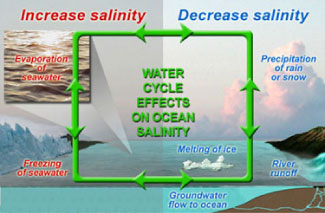
Salinity patterns are governed by geographic differences in the "water budget." For example, like on continents, some areas of the ocean are rainy whereas others are arid and "desert-like." To learn more about the factors that influence salinity patterns, we invite you investigate five pairs of data maps centered over the North Atlantic Ocean (listed below). Each map shows monthly conditions based on long-term averages. The challenge is to find the data set that most closely corresponds to sea surface salinity patterns. Grade level 5-8: Look at monthly maps of: air temperature vs. sea surface salinity and precipitation vs. sea surface salinity. Are any of these data sets closely correlated with solar energy input (e.g., seasonal change)? Grade level 9-12: For the North Atlantic Ocean, look at monthly maps of air temperature vs. sea surface salinity and precipitation vs. sea surface salinity and evaporation vs. sea surface salinity. Are changes in these data sets closely correlated with solar energy input (e.g., seasonal change) in the North Atlantic ocean? Look at these videos -- Sea Surface Salinity and Components of the Water Cycle for global data sets of sea surface temperature, precipitation, and evaporation. Grade level: 9-12 Theme: water cycle Flat Tool: http://ourocean.jpl.nasa.gov/AQUARIUS/chp3.jsp GoogleEarth Interface Tool: http://aquarius.jpl.nasa.gov/AQUARIUS_DEV/chp3.jsp Create global maps of mean conditions for any year(s) from 1800 to 2005 at designated depths (down to 1500m) using the pull-down menus. Annual time-series graphs of salinity, temperature, or density can be plotted by selecting up to six locations (by clicking on the map or typing latitude/latitude information into the fields below). These time-series graphs can also represent up to six different depths. Plotted data will also be shown in a table that is easily downloaded (e.g., into Excel). Source is actual, non-interpolated database measurements. Focus Questions | Flat Tool Tutorial | |||||||||||||||